Making the most out of dataset visualization in an industrial context
By Marie-Caroline Corbineau, Kévin Sanchis and Tugdual Ceillier for Preligens, 21/06/22
How visualizing the feature space sheds light on the impact of self-supervised pre-training
Co-authored by Kévin Sanchis and Tugdual Ceillier
At Preligens, a lot of time and resources are dedicated to R&D. We are part of a team of researchers that strive to apply novel ideas from the literature to real world applications.
Nowadays, as machine learning datasets and models are becoming increasingly bigger and more complex, it is all the more important to take the time to understand the type of data we work on and how different models can behave when trained on it. However, to do so, one needs tools that are not always easy to apply at scale. One of the well-known domains of data analysis is dataset visualization, which encompasses several tools such as PCA, t-SNE or UMAP.
In this post, we will describe the problematic we faced regarding data visualization, which tool we decided to use and how we applied it in production. To demonstrate how this tool can be used, we apply it on homemade research toy-detectors. Finally we will give a summary of the insights we gained from using data visualization.
Why do we need visualization?
It is no secret that, in the AI industry, data plays a major role in algorithmic performance. However, although satellite images are at the core of our detector development cycle, the way our detectors really perceive their input data remains a mystery. Data scientists must then resort to following their common sense and intuition, both of which can be deceived.
In addition, working in an industrial context makes things even more difficult. For instance, when updating an in-production algorithm to better suit our clients’ expectations, selecting appropriate training images that improve the model in a reasonable amount of time while preventing catastrophic forgetting¹ is a challenge.
Most of our troubles come from the inadequacies of the usual metrics and tools used in the industry to evaluate the behavior of a neural network.
On the hardships of evaluating a detector
To evaluate a detector, we use metrics such as the recall (percentage of true objects that are detected), precision (percentage of detections that are true objects) or F1-score (a combination of the previous two metrics). These metrics can be computed on the global testing sets but also per image and per geographical area. For classification, we also compute the confusion matrix detailing the performance per class, and per level when we use a hierarchical classification. Some of our detectors predict several dozens of classes, leading to very large confusion matrices.
As a result, it can be difficult for data scientists to make sense and to get a global picture of the detector’s behavior from this wealth of quantitative metrics. Therefore, gathering qualitative insights regarding a detector is fundamental in our line of work, but this kind of analysis remains manual and time-consuming.
Metadata and visualization to the rescue
Most of the data that we address at Preligens is satellite imagery. Each satellite image is associated with metadata, to which the neural network does not have a direct access, since it only knows the pixels’ values. However, metadata can be indirectly extracted by the encoder, and thus can play an important role in the detector’s behavior.
These metadata are a way to summarize the information included in an image in a way that is understandable by a human. Examples of such metadata are: a description of the environmental context like “desertic”, “urban” or “coastal”, the amount of snow, the image quality, the satellite type, the geographical location, the acquisition time, the number of observables of each class, etc. As it is detailed in our previous post on the description of satellite images, at Preligens we pay attention to gathering these metadata in our database.
To better evaluate a neural network and perform data selection, data scientists at Preligens expressed the need for a visualization tool that helps make conjectures about the causal relationship between metadata and the performance of the detector. These conjectures can then be tested through experiments by fine-tuning the network on certain types of images.
Getting the best look at our data
Now that we know why visualization is the appropriate tool to use in our context, let’s dive into how we can use it easily and efficiently with building blocks that are reusable and expandable for other data scientists at Preligens.
Which visualization method?
One difficulty we face is that we work on large dimensional inputs, while humans generally prefer to visualize things in 2D or 3D. There exists several approaches to reduce the dimension while preserving the local and/or global structure of the dataset, like PCA, t-SNE or UMAP to name only a few. Among these tools we chose to use the more recent and widely-used UMAP, which is faster than t-SNE and which better preserves the global structure of the dataset².
Building an industrial pipeline
To ensure that we could iterate quickly in our experiments, and that all data scientists in the company could easily use and update our code, we built a pipeline in our AI framework made of different steps or tasks. These tasks can be used either independently, or conjointly: the main objective is to create some building blocks that answer our needs, but also are generic enough to be used in various other ways!

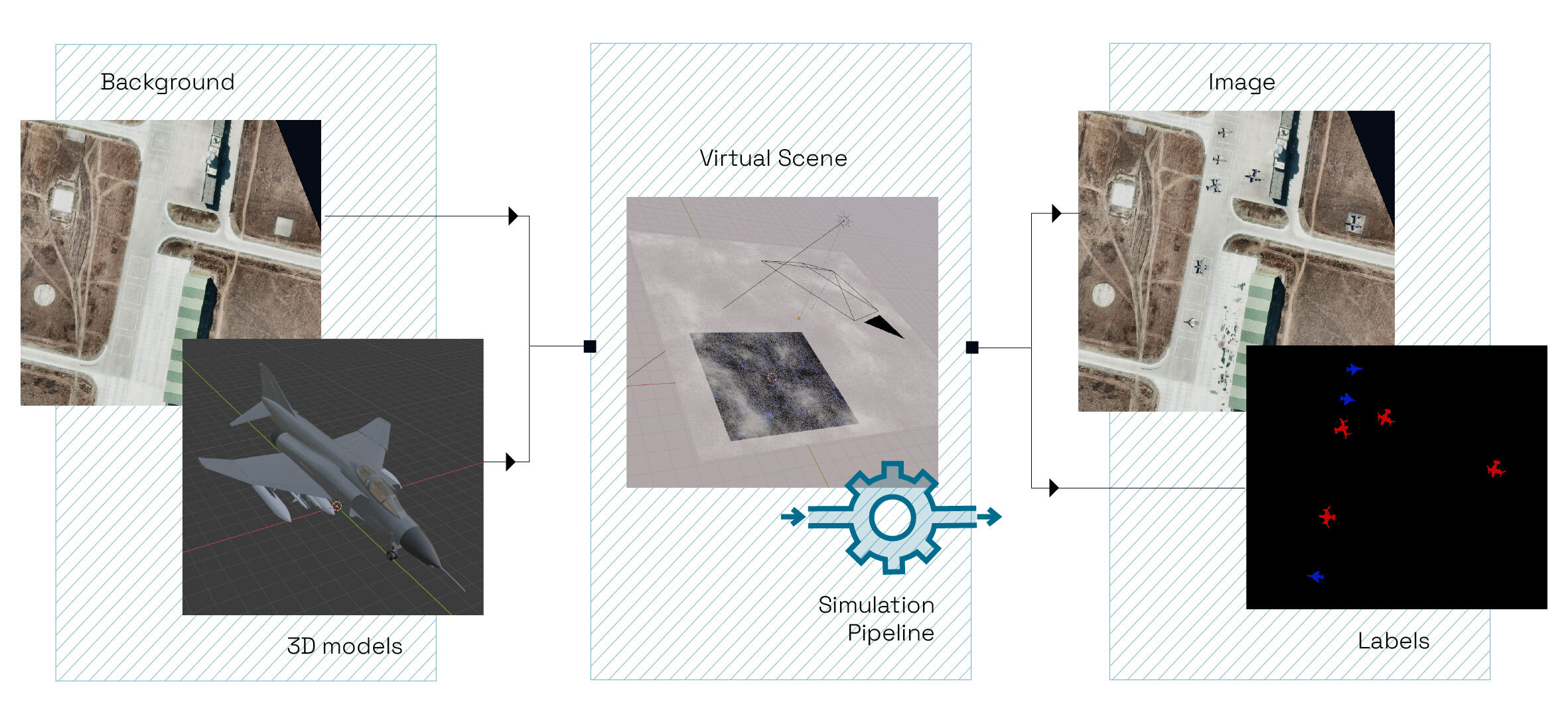
A simplified view of our pipeline, composed of three steps (in yellow). Source: Preligens, Satellite image by Maxar
Our pipeline is composed of three simple tasks:
- ExtractFeatures, which is responsible for running inference on a dataset in order to extract an n-dimensional embedding from some intermediate layer of a given detector.
- ReduceDimensions that applies a dimension reduction method on a given n-dimensional embedding. The user is left with the choice of the method and the target number of dimensions. In our case, we simply needed to support UMAP³, but this task is built so that it’s easy to add support for new methods!
- PlotTiledDataset which precisely offers what we were looking for in the first place: creating some plots to visualize two-dimensional features. For our experiments, we only used interactive scatter plots based on plotly, but we could easily imagine offering support for various types of plots if necessary.
Once this pipeline has been set up, the only thing the user has to do is provide a dataset, a trained model, and a configuration file that maps inputs and outputs between tasks.
As a result, we built something that strives to be:
- easy to use by any data scientist without knowing about the details,
- flexible as one doesn’t need to go through all the tasks if, for example, one has some two-dimensional features ready to be displayed,
- generic as these tasks can be used outside of the scope of this post,
- modular as new methods or new plot types can easily be added inside the existing code.

An example of density plot for a dataset: each small dot represents one image. Source: Preligens
Making visualization useful
Now that we have a way of generating plots to visualize our datasets, it feels a bit lackluster to be able to only see the distribution of images in the 2D space.
In fact, we can do more: using this as a baseline and display several metadata on top of it!
However, a lot of things can be displayed, and it’s not easy to choose the right metadata, and gather insights from it. Let’s have a closer look at some interesting metadata we used in our experiments.
It shall be noted that satellite images are very large: usually several dozens of km², hence we usually divide them into tiles: on the following plots, each point corresponds to a tile.

A plot that shows the average color of each tile. Source: Preligens
In this plot, we display the average color of images, which is computed by averaging the pixel colors, and then using the K-Means clustering algorithm to control the number of colors we display: otherwise there is a high chance that all images will have a different average color, and the number of legend entries would be too high.
In our context, this metadata is useful to have a global view of the context of our satellite images: is it desertic (brown)? urban (gray)? close to the sea (blue)? It also helps us understand if the average color and context is a differentiating factor between input images from the detector’s point of view.

A plot that highlights both train and val sets in a different color. Source: Preligens
When we talk about a dataset, we consider it as a set of training tiles and validation tiles. In such a case, we can use visualization to compare the training set and the validation set by highlighting the tiles based on their origin. This way, one can see if both sets are similar — if they cover the same space — or different, and use this insight to update the validation set if necessary.
More generally, it is always interesting to compare several datasets in this space. One could also imagine building a testing set according to the visualization, that is focusing on a specific part of the space that contains corner cases.

A plot that displays the number of missed detections of our research toy-detector for each tile. Source: Preligens
When evaluating a model, it’s not always easy to visualize its performance on a specific set of tiles and understand in which cases it doesn’t perform well. This plot displays the number of missed detections on each image, which gives a global overview of how the model is performing on the dataset, and makes it possible to see on which images the model performs poorly. Then, it is easier to understand what makes them hard by visualizing the set of tiles — and maybe creating a specific testing set for this type of image that could be considered corner cases.
This is only a sample of all the metadata we can display on this kind of plot. In the end, having good, displayable metadata is as essential as selecting the proper reduction algorithm, or the best type of plot for our needs.
Scatter plots can be seen as a canvas on top of which we can display all sorts of information, and should be used this way to make the most out of the tool.
As a picture is worth a thousand words, let’s dive deeper into our application of data visualization to compare two different models and see what we can learn from it!
Fully-supervised VS Self-supervised
In the context of object detection on satellite images, we compared two different vehicle detectors. The first model — the standard one — has been pre-trained in a supervised way on ImageNet, while the second one is pre-trained in a self-supervised way on the fMoW dataset. Finally, both have been fine-tuned in a supervised way on one of our datasets.
The idea is to apply the above pipeline on both models so that we can have a look at the same training set from their point of view. It turns out that the results are strikingly different.

Comparing two models trained on the same dataset. Left: supervised — Right: self-supervised. Source: Preligens
In the next section, we illustrate how the pipeline can be used to evaluate the models and draw conjectures to explain their differences.
A matter of perspective
As we can see in the above picture, using features from two different models for UMAP, even if they have been trained on the same data, leads to very different results.
Compared to the self-supervised model’s plot, in which the density is quite homogeneous, in the supervised model’s point of view, we can see several small groups of tiles that are scattered around the space. In other words, this means that the features extracted from the model are quite different from each other amongst these groups. It feels as if the model was very specialized and manages to see small details that make the difference. However, such a behavior is not always a good thing, as it might mean that the model suffers from overfitting.
Learning from metadata
So far, we’ve only scratched the surface of what this visualization pipeline can offer. Using the metadata we mentioned in the previous section, we can infer much more.

Visualizing geographical sites distribution for both models: each color represents a different location. Source: Preligens
In this plot, each color represents a geographical site where satellite images have been taken. We can see that extracted features from the model are quite different depending on the site, but only from the supervised model’s point of view! We could imagine that the supervised model pays much more attention to the overall context (maybe due to its ImageNet pretraining?) whereas the self-supervised model is focusing on other aspects.

Visualizing labels distribution for both models. Source: Preligens
Here, each color represents the presence of at least one observable of the given label in the image. As such, multiple points can be superposed as an image can contain multiple observables, and so multiple labels. Overall, it’s hard to notice a clear difference of space coverage for the different labels in the supervised model’s case, whereas it’s pretty clear in the self-supervised model’s plot: labels are not covering the same space at all, except for a common part in the middle!
This is very interesting, as it could mean that the self-supervised model’s features are much more “label-focused” compared to the supervised model’s features which are context-focused.

Visualizing the number of observables per tile for both models: the darker it is, the smaller the number of objects is. Source: Preligens
To confirm the aforementioned claims about the self-supervised being label-focused, we can have a look at the number of observables per tile. Once again, there are no noticeable differences in the supervised model’s case, whereas we can see a clear gradient from right (no or few observables) to left (many observables) on the self-supervised model’s plot. This tends to confirm that the overall form of the embedding highly depends on the labels for the self-supervised model.

Visualizing the number of missed detection per tile for both models: the darker it is, the smaller the number of missed detections is. Source: Preligens
Finally, by having a look at the number of missed detections per tile for both models, in the self-supervised model’s case, we can see that most of the missed detections are found in the part of the embedding where Class A vehicles are, while performance is better in the part occupied by vehicles from Class B. This makes sense as both models are trained on public datasets that usually do not include Class A vehicles which are more defense-related!
Of course, there is a lot more that one could learn from this kind of plot. However, by analyzing a small amount of them, we managed to get a good grasp of the specificities of each model, which shows how powerful data visualization can be! It could be also very useful to compare different pretrained weights, or simply to understand what pretraining is bringing to the model in terms of features.
Other ideas of application
In this post, we described one way of applying data visualization for a specific use-case where one wants to compare two models. However, there are many more applications that are as interesting! Here are a few ideas based on what we worked on and what we thought would be useful.
Dataset Condensation
Dataset condensation is the process of selecting a subset of a training set for future fine-tunings. The goal is to avoid the training time to grow larger and larger because of new data being added at each fine-tuning step. It is a tricky operation since training data has a direct influence on the detectors’ performance. The proposed data visualization pipeline can help better select the data that we wish to keep: new dataset condensation strategies can be designed based on these plots!
Corner Case Identification
The introduced visualization pipeline can also help identify outliers in the two-dimensional space. By outliers, we mean points that are very isolated, or right on the frontier of the groupings. These images can correspond to corner-cases, i.e. situations rarely seen by the model and which can lead to unsatisfactory and unpredictable results. Identifying these corner cases is crucial to design insightful testing sets, but also to select important data to keep during fine-tuning in subsequent update development cycles.
Conclusion
As the data-centric approach is taking roots in the deep learning community, it is all the more important to have access to the right tools that allow data scientists to better explore and understand data. We shared here how we successfully incorporated such a visualization technique into our industrial development process and how we gained insights from it.
We hope it will inspire other companies to implement similar tools and share their experience and usage!
¹ Phenomenon that is likely to happen when a model is fine-tuned without care : it forgets everything about its previous training(s).
² For more information on this we refer to this post.
³ We used the python package umap-learn.